
Designing a smarter way to swap batteries at Ampersand
The Smart Swap Cabinet, where the screen and the hardware work together so drivers can swap on their own.
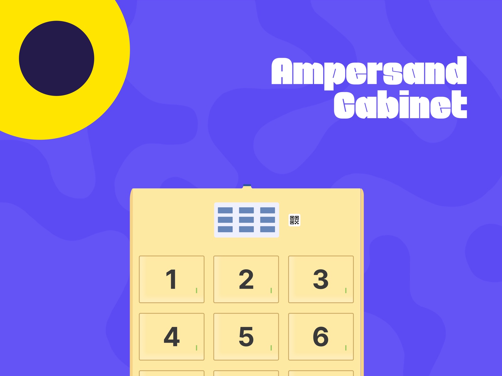
Some of the most interesting design challenges happen when the interface isn't just on a screen, but part of the physical world.
At Ampersand, we were exploring how to make battery swapping simpler, faster, and more independent for electric motorcycle drivers. The Smart Swap Cabinet was an opportunity to rethink the experience beyond the traditional station setup, bringing the physical battery exchange and the digital interface together into one connected journey.
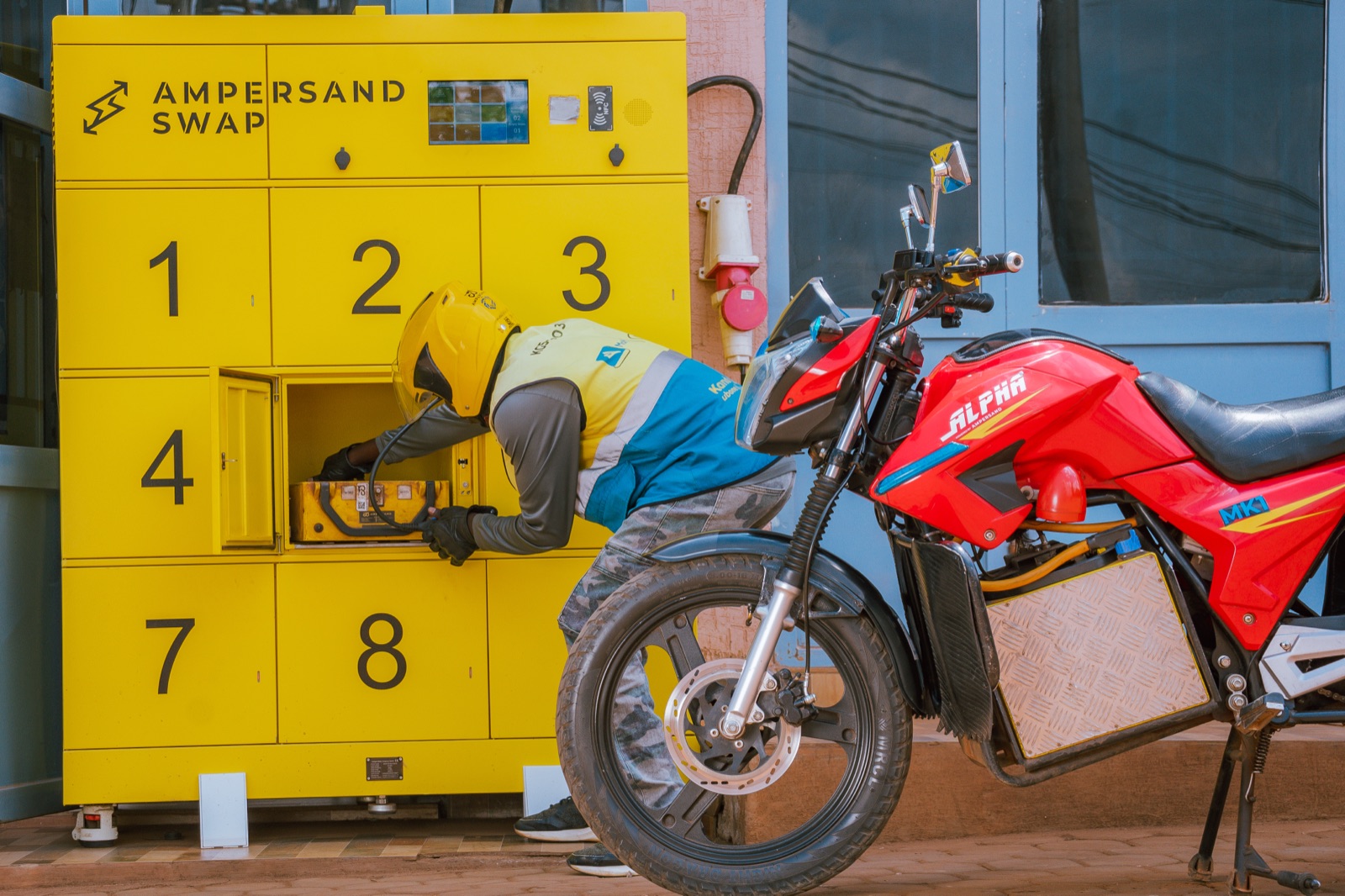
The challenge I kept coming back to was simple: How do you make a technically complex process feel effortless to someone who's just trying to get back on the road?
A battery swap involves more than inserting and removing a battery. There are system checks, battery identification, slot availability, and situations where things don't go as expected. All of this happens in a physical environment where drivers need clear guidance, immediate feedback, and as little friction as possible.
I wanted the experience to feel intuitive from the first interaction. Not something drivers had to learn, but something they could understand as they went.
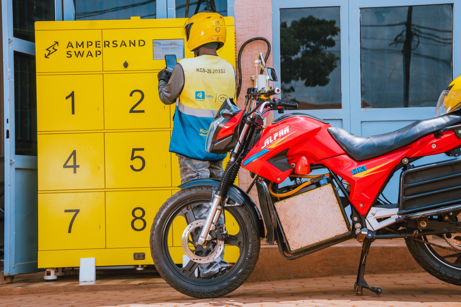
One of my biggest design considerations was communication. We couldn't assume every driver would be comfortable reading detailed instructions or navigating a conventional app interface. So I leaned into visual storytelling, using illustrations and step-by-step guidance to make each action easier to understand. Instead of telling drivers what to do through blocks of text, we designed the interface to show them.
The physical cabinet became part of the interface, too. A screen could tell someone what to do, but the hardware had to make the next action obvious. I spent time thinking about how these two worlds could work together: how a driver would understand where to place a battery, recognize when an action was complete, and know what to do if something went wrong.
And then there were the moments outside the happy path.
What happens when a driver inserts the wrong battery? What if a slot is unavailable? How should the interface respond when the system can't complete an action? These were the details that mattered just as much as the main flow. We explored the different states, designed the feedback, and worked through the recovery paths so that a mistake wouldn't leave someone stuck wondering what to do next.
I translated these scenarios into wireframes, high-fidelity screens, and interactive prototypes, iterating on the flow until the experience made sense as a sequence of real-world actions rather than just a collection of screens.
Another important consideration was consistency across the Ampersand ecosystem. Drivers already interacted with our digital products during their swapping journeys, so the cabinet needed to feel like a natural extension of that experience. The goal wasn't to introduce another disconnected interface. It was to create a more cohesive relationship between the driver, the software, the battery, and the cabinet itself.
What I enjoyed most about this project was designing at the intersection of software and hardware. Every interaction had a physical consequence. An unclear instruction could interrupt a swap. A missing confirmation could create uncertainty. A well-timed visual cue could help a driver complete the process without assistance.
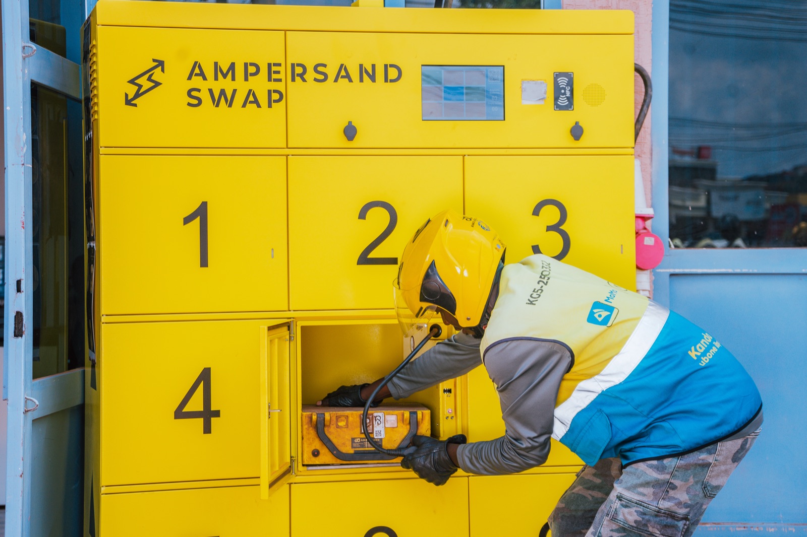
It pushed me to think beyond whether a screen looked right and focus on whether the entire experience worked in the real world.
For me, the Smart Swap Cabinet was a reminder that good UX isn't always about adding more features or making an interface more sophisticated. Sometimes, it's about removing the things that make people stop, think, or ask for help.
We were working toward a swapping experience that felt more visual, more self-service, and easier to repeat, while laying the groundwork for a more scalable battery-swapping operation.
The ambition was simple: make the technology do the complicated work, so the driver doesn't have to.